2023. 11. 28. 18:06ㆍ개발/💠 Alchemist
1. K-평균 알고리즘 이해
K-평균 알고리즘
K-평균 알고리즘
- 군집 중심점(centeroid)이라는 특정한 임의의 지점을 선택해 해당 중심에 가장 가까운 포인트들을 선택하는 군집화 기법
- 군집화에서 가장 일반적으로 사용되는 알고리즘
군집 중심점의 이동 프로세스
구성하려는 군집화 개수만큼 군집 중심점 설정 (초기화 알고리즘으로 적합한 곳에 위치시킴)
-> 각 데이터는 가장 가까운 중심점에 소속
-> 군집 중심점을 소속된 데이터들의 평균 중심으로 이동
-> 각 데이터는 이동한 군집 중심점 기준으로 가장 가까운 중심점으로 소속 변경
-> 군집 중심점을 다시 소속 데이터들의 평균 중심으로 이동
이때 군집 중심점이 이동했음에도 데이터들의 소속이 변하지 않는다면 군집화 완료

K-평균의 장점
- 일반적인 군집화에서 가장 많이 활용
- 알고리즘이 쉽고 간결
K-평균의 단점
- 거리 기반 알고리즘으로 속성의 개수가 매우 많을 경우 군집화 정확도가 떨어짐
- 반복을 수행하기 때문에, 반복 횟수가 많을 경우 수행 시간이 매우 느려짐
- 몇 개의 군집을 선택해야 할지 가이드하기 어려움
사이킷런 KMeans 클래스 소개
KMeans 클래스 파라미터
class sklearn.cluster.KMeans(n_clusters=8, init='k-means++', n_init=10, max_iter=300, tol=0.0001, precompute_distances='auto', verbose=0,random_state=None,copy_x=True, n_jobs=1, algorithm='auto')
주요 파라미터 소개
- n_clusters : 군집화 개수, 군집 중심점의 개수
- init : 초기 군집 중심점 좌표 설정 방식 / 대부분 k-means++ 방식 사용
- max_iter : 최대 반복 횟수
주요 속성 소개
- labels_ : 각 데이터 포인트가 속한 군집 중심점 레이블
- cluster_centers_ : 각 군집 중심점 좌표
K - 평균을 이용한 붓꽃 데이터 세트 군집화
데이터세트 및 모델 로드
from sklearn.preprocessing import scale
from sklearn.datasets import load_iris
from sklearn.cluster import KMeans

import matplotlib.pyplot as plt
import numpy as np
import pandas as pd
%matplotlib inline

iris = load_iris()
# 더 편리한 데이터 핸들링을 위해 DataFrame으로 변환
irisDF = pd.DataFrame(data=iris.data, columns=['sepal_length', 'sepal_width','petal_length', 'petal_width'])
irisDF.head(3)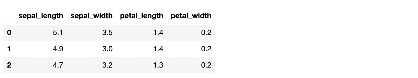
K-평균 모델 생성 및 수행
kmeans = KMeans(n_clusters=3, init='k-means++', max_iter=300, random_state=0)
kmeans.fit(irisDF)
각 데이터가 어떤 군집에 속해있는지 확인
print(kmeans.labels_)
군집화 결과(labels_)를 target값과 비교하여 군집화가 얼마나 잘 수행되었는지 확인
irisDF['target'] = iris.target
irisDF['cluster'] = kmeans.labels_
iris_result = irisDF.groupby(['target', 'cluster'])['sepal_length'].count()
print(iris_result)
- 분류 타깃이 0인 데이터는 1번 군집으로 grouping됨
- 분류 타깃이 1인 데이터는 2개를 제외하고 0번 군집으로 grouping됨
- 분류 타깃이 2인 데이터는 0번 군집 14개, 2번 군집 36개로 분산되어 grouping됨
군집화 결과 2차원상에서 표현하기 위해 차원 축소 수행( 4차원 -> 2차원 )
from sklearn.decomposition import PCA

pca = PCA(n_components=2)
pca_transformed = pca.fit_transform(iris.data)

irisDF['pca_x'] = pca_transformed[:, 0]
irisDF['pca_y'] = pca_transformed[:, 1]
irisDF.head(3)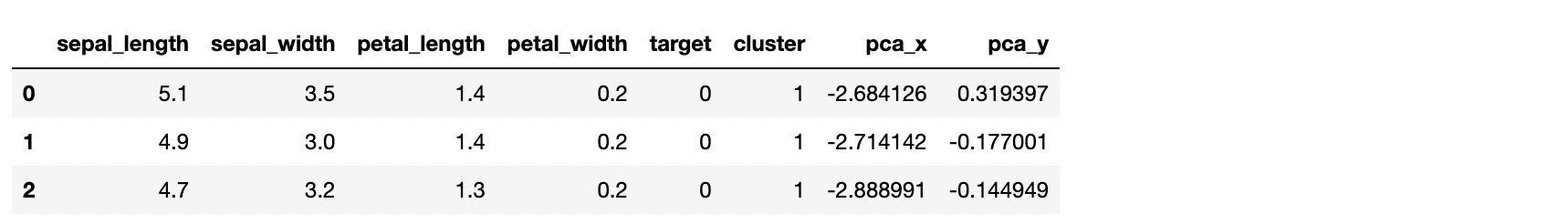
군집화 결과 시각화
# 군집 값이 0, 1, 2인 경우마다 별도의 인덱스로 추출
marker0_ind = irisDF[irisDF['cluster']==0].index
marker1_ind = irisDF[irisDF['cluster']==1].index
marker2_ind = irisDF[irisDF['cluster']==2].index

# 군집 값 0, 1, 2에 해당하는 인덱스로 각 군집 레벨의 pca_x, pca_y 값 추출. o, s, ^ 로 마커 표시
plt.scatter(x=irisDF.loc[marker0_ind, 'pca_x'], y=irisDF.loc[marker0_ind, 'pca_y'], marker='o')
plt.scatter(x=irisDF.loc[marker1_ind, 'pca_x'], y=irisDF.loc[marker1_ind, 'pca_y'], marker='s')
plt.scatter(x=irisDF.loc[marker2_ind, 'pca_x'], y=irisDF.loc[marker2_ind, 'pca_y'], marker='^')

plt.xlabel('PCA1')
plt.ylabel('PCA2')
plt.title('3 Clusters Visualization by 2 PCA Components')
plt.show()
- 1번 군집은 완전히 분리됨
- 0번 과 2번 군집이 완전히 분리되지 않음
군집화 알고리즘 테스트를 위한 데이터 생성
사이킷런은 다양한 유형의 군집화 알고리즘을 테스트해 보기 위한 간단한 데이터 생성기를 제공함
-> make_blobs(), make_classification() / make_circle(), make_moon()
make_blobs() : 대표적인 데이터 생성기, 개별 군집의 중심점과 표준 편차 제어 기능 존재
make_classification() : 대표적인 데이터 생성기, 노이즈 포함한 데이터 세트 생성
make_circle() / make_moon() : 중심 기반의 군집화로 해결하기 어려운 데이터 세트 생성에 사용
make_blobs() 사용 예시
make_blobs()로 데이터세트 생성
import numpy as np
import matplotlib.pyplot as plt
from sklearn.cluster import KMeans
from sklearn.datasets import make_blobs
%matplotlib inline

# 총 데이터 개수:200, 피처 개수:2, 군집 중심점:3, 데이터 분포도:0.8
X, y = make_blobs(n_samples=200, n_features=2, centers=3, cluster_std=0.8, random_state=0)
print(X.shape, y.shape)

# y target 값의 분포를 확인
unique, counts = np.unique(y, return_counts=True)
print(unique, counts)
DataFrame으로 변환
import pandas as pd

clusterDF = pd.DataFrame(data=X, columns=['ftr1','ftr2'])
clusterDF['target'] = y
clusterDF.head(3)
데이터세트 시각화
target_list = np.unique(y)

# 각 타깃별 산점도의 마커 값
markers = ['o', 's', '^', 'P', 'D', 'H', 'x']

# 3개의 군집 영역으로 구분한 데이터세트를 생성했으므로 target_list는 [0, 1, 2]
# target==0, target==1, target==2로 scatter plot을 marker별로 생성
for target in target_list:
    target_cluster = clusterDF[clusterDF['target']==target]
    plt.scatter(x=target_cluster['ftr1'], y=target_cluster['ftr2'], edgecolor='k', marker=markers[target])
plt.show()
K-평균 수행 후 군집화 결과 시각화
# KMeans 객체를 이용해 X 데이터를 K-Means 클러스터링 수행
kmeans = KMeans(n_clusters=3, init='k-means++', max_iter=200, random_state=0)
cluster_labels = kmeans.fit_predict(X)
clusterDF['kmeans_label'] = cluster_labels

# cluster_centers_ 는 개별 클러스터의 중심 위치 좌표 시각화를 위해 추출
centers = kmeans.cluster_centers_
unique_labels = np.unique(cluster_labels)
markers = ['o', 's', '^', 'P', 'D', 'H', 'x']

# 군집된 label 유형별로 iteration 하면서 marker 별로 scatter plot 수행
for label in unique_labels:
    label_cluster = clusterDF[clusterDF['kmeans_label']==label]
    center_x_y = centers[label]
    plt.scatter(x=label_cluster['ftr1'], y=label_cluster['ftr2'], edgecolor='k', marker=markers[label])

    # 군집별 중심 위치 좌표 시각화
    plt.scatter(x=center_x_y[0], y=center_x_y[1], s=200, color='white',
               alpha=0.9, edgecolor='k', marker=markers[label])
    plt.scatter(x=center_x_y[0], y=center_x_y[1], s=70, color='k',
               edgecolor='k', marker='$%d$' % label)
plt.show()
군집화가 얼마나 잘 수행되었는지 확인
print(clusterDF.groupby('target')['kmeans_label'].value_counts())
2. 군집 평가 ( Cluster Evaluation )
군집화 데이터세트는 분류와 다르게 비교할 만한 타깃 레이블을 가지고 있지 않다
실루엣 분석의 개요
실루엣 분석
- 각 군집 간의 거리가 얼마나 효율적으로 분리돼 있는지 나타냄
- 동일 군집끼리는 가깝게 잘 뭉쳐져 있을수록, 다른 군집끼리는 잘 떨어져 있을수록 군집화가 잘 일어난 것
- 군집화가 잘 될수록 개별 군집은 비슷한 정도의 여유 공간을 가지고 떨어져 있음
실루엣 계수 : 개별 데이터가 가지는 군집화 지표 / 동일 군집과 얼마나 가까운지, 다른 군집과 얼마나 떨어져있는지
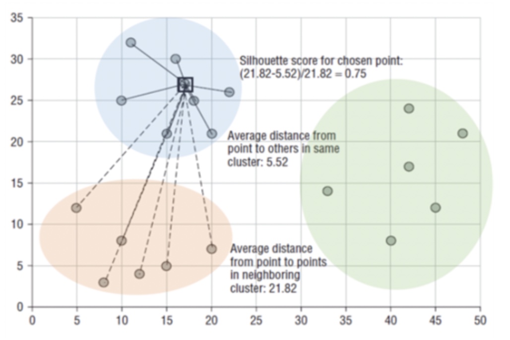

- a(i) : A 클러스터 내의 다른 데이터 포인트들간의 평균 거리
- b(i) : B 클러스터 내의 다른 데이터 포인트들간의 평균 거리
- b(i) - a(i) 는 클러스터간의 평균 거리
- b(i) - a(i) 값의 정규화를 위해 max( a(i), b(i) )으로 나눔
-1 ~1 사이 값을 가짐
1에 가까울수록 군집간 거리 멂, 0에 가까울수록 군집간 거리 가까움, 음수값 : 다른 군집에 데이터 포인트가 할당
실루엣 분석을 위한 메서드
- sklearn.metrics.silhouette_samples() : 각 데이터 포인트의 실루엣 계수 반환
- sklearn.metrics.silhouette_score() : 각 데이터 포인트의 실루엣 계수 평균 반환
좋은 군집화 조건
- 전체 실루엣 계수의 평균값이 1에 가까울수록
- 개별 군집의 평균값의 편차가 크지 않을수록
붓꽃 데이터 세트를 이용한 군집 평가
K-평균으로 군집화 실행 후 실루엣 분석 수행
from sklearn.preprocessing import scale
from sklearn.datasets import load_iris
from sklearn.cluster import KMeans
# 실루엣 분석 평가 지표 값을 구하기 위한 API 추가
from sklearn.metrics import silhouette_samples, silhouette_score
import matplotlib.pyplot as plt
import numpy as np
import pandas as pd

%matplotlib inline

iris = load_iris()
feature_names = ['sepal_length', 'sepal_width', 'petal_length', 'petal_width']
irisDF = pd.DataFrame(data=iris.data, columns=feature_names)
kmeans = KMeans(n_clusters=3, init='k-means++', max_iter=300, random_state=0).fit(irisDF)
irisDF['cluster'] = kmeans.labels_

#iris의 모든 개별 데이터에 실루엣 계수 값을 구함
score_samples = silhouette_samples(iris.data, irisDF['cluster'])
print('silhouette_samples() return 값의 shape', score_samples.shape)

#irisDF에 실루엣 계수 칼럼 추가
irisDF['silhouette_coeff'] = score_samples

#모든 데이터의 평균 실루엣 계수 값을 구함.
average_score = silhouette_score(iris.data, irisDF['cluster'])
print('붓꽃 데이터 세트 Silhouette Analysis Score:{0:.3f}'.format(average_score))
irisDF.head(3)

- 위의 3줄은 실루엣 계수가 약 0.8로 꽤 좋은 결과를 나타내고 있다
- 실루엣 계수의 전체 평균이 약 0.5로 낮은 것으로 보아 나머지 군집이 제대로 분리되지 않았음을 추론할 수 있음
군집별 평균 실루엣 계수 확인
irisDF.groupby('cluster')['silhouette_coeff'].mean()
- groupby를 통해 군집별로 얼마나 잘 분리되었는지 정확히 판단할 수 있음
- 1번 군집만 제대로 분리되었으며 나머지 0번, 2번 군집은 실루엣 계수가 낮은 걸 확인할 수 있음
군집별 평균 실루엣 계수의 시각화를 통한 군집 개수 최적화 방법
visualize_silhouette() 함수 - 실루엣 계수 시각화 함수
def visualize_silhouette(range_n_clusters, X):
    from sklearn.datasets import make_blobs
    from sklearn.cluster import KMeans
    from sklearn.metrics import silhouette_samples, silhouette_score

    import matplotlib.pyplot as plt
    import matplotlib.cm as cm
    import numpy as np

    for n_clusters in range_n_clusters:
        # Create a subplot with 1 row and 2 columns
        fig, (ax1, ax2) = plt.subplots(1, 2)
        fig.set_size_inches(18, 7)

        # The 1st subplot is the silhouette plot
        # The silhouette coefficient can range from -1, 1 but in this example all
        # lie within [-0.1, 1]
        ax1.set_xlim([-0.1, 1])
        # The (n_clusters+1)*10 is for inserting blank space between silhouette
        # plots of individual clusters, to demarcate them clearly.
        ax1.set_ylim([0, len(X) + (n_clusters + 1) * 10])

        # Initialize the clusterer with n_clusters value and a random generator
        # seed of 10 for reproducibility.
        clusterer = KMeans(n_clusters=n_clusters, random_state=10)
        cluster_labels = clusterer.fit_predict(X)

        # The silhouette_score gives the average value for all the samples.
        # This gives a perspective into the density and separation of the formed
        # clusters
        silhouette_avg = silhouette_score(X, cluster_labels)

        # Compute the silhouette scores for each sample
        sample_silhouette_values = silhouette_samples(X, cluster_labels)

        y_lower = 10
        for i in range(n_clusters):
            # Aggregate the silhouette scores for samples belonging to
            # cluster i, and sort them
            ith_cluster_silhouette_values = \
                sample_silhouette_values[cluster_labels == i]

            ith_cluster_silhouette_values.sort()

            size_cluster_i = ith_cluster_silhouette_values.shape[0]
            y_upper = y_lower + size_cluster_i

            color = cm.nipy_spectral(float(i) / n_clusters)
            ax1.fill_betweenx(np.arange(y_lower, y_upper),
                              0, ith_cluster_silhouette_values,
                              facecolor=color, edgecolor=color, alpha=0.7)

            # Label the silhouette plots with their cluster numbers at the middle
            ax1.text(-0.05, y_lower + 0.5 * size_cluster_i, str(i))

            # Compute the new y_lower for next plot
            y_lower = y_upper + 10  # 10 for the 0 samples

        ax1.set_title('Number of Cluster : '+ str(n_clusters)+'\n' \
                              'Silhouette Score :' + str(round(silhouette_avg,3)))
        ax1.set_xlabel("The silhouette coefficient values")
        ax1.set_ylabel("Cluster label")

        # The vertical line for average silhouette score of all the values
        ax1.axvline(x=silhouette_avg, color="red", linestyle="--")

        ax1.set_yticks([])  # Clear the yaxis labels / ticks
        ax1.set_xticks([-0.1, 0, 0.2, 0.4, 0.6, 0.8, 1])

        # 2nd Plot showing the actual clusters formed
        colors = cm.nipy_spectral(cluster_labels.astype(float) / n_clusters)
        ax2.scatter(X[:, 0], X[:, 1], marker='.', s=30, lw=0, alpha=0.7,
                    c=colors, edgecolor='k')

        # Labeling the clusters
        centers = clusterer.cluster_centers_
        # Draw white circles at cluster centers
        ax2.scatter(centers[:, 0], centers[:, 1], marker='o',
                    c="white", alpha=1, s=200, edgecolor='k')

        for i, c in enumerate(centers):
            ax2.scatter(c[0], c[1], marker='$%d$' % i, alpha=1,
                        s=50, edgecolor='k')

        ax2.set_title("The visualization of the clustered data.")
        ax2.set_xlabel("Feature space for the 1st feature")
        ax2.set_ylabel("Feature space for the 2nd feature")

        plt.suptitle(("Silhouette analysis for KMeans clustering on sample data "
                      "with n_clusters = %d" % n_clusters),
                     fontsize=14, fontweight='bold')

    plt.show()
실루엣 계수 시각화 함수 참고
https://scikit-learn.org/stable/auto_examples/cluster/plot_kmeans_silhouette_analysis.html
Selecting the number of clusters with silhouette analysis on KMeans clustering
Silhouette analysis can be used to study the separation distance between the resulting clusters. The silhouette plot displays a measure of how close each point in one cluster is to points in the ne...
scikit-learn.org
make_blobs()로 임의의 데이터세트 생성 후 실루엣 계수 시각화
from sklearn.datasets import make_blobs
X, y = make_blobs(n_samples=500, n_features=2, centers=4, cluster_std=1,
                 center_box=(-10.0, 10.0), shuffle=True, random_state=1)

visualize_silhouette([2, 3, 4, 5], X)


군집 2개 : 두 군집이 확실히 분리됐지만 0번 군집의 내부 요소간 거리가 매우 크다 / 평균 실루엣 계수 값 : 0.704
군집 3개 : 0번과 2번 군집이 제대로 분리되지 않는다 / 2번 군집의 실루엣 계수가 평균보다 작다 / 평균 실루엣 계수 값 : 0.588
군집 4개 : 군집별 실루엣 계수 값이 비교적 균일하다 / 평균 실루엣 계수 값 : 0.65
군집 5개 : 0번과 4번 군집의 실루엣 계수가 평균보다 확연히 작다 / 평균 실루엣 계수 값 : 0.575
-> 시각화 결과 군집이 4개일 때 가장 이상적으로 군집화가 일어났음을 확인할 수 있다
-> 군집화를 평가하는 지표 : 평균 실루엣 계수 값 / 군집별 실루엣 계수 값이 얼마나 균일한지
3. 평균 이동
평균 이동의 개요
평균 이동 : 중심을 군집의 중심으로 지속적으로 움직이면서 군집화를 수행하는 방식
K-평균 vs 평균 이동 - 중심을 어디로 이동시키는가?
평균 이동 : 데이터의 밀도가 가장 높은 곳
K-평균 : 데이터의 평균 거리의 중심으로
평균 이동의 중심점 이동 프로세스
1. 개별 데이터의 특정 반경 내에 주변 데이터를 포함한 데이터 분포도를 KDE의 Mean Shift 알고리즘으로 계산
2. 데이터를 KDE로 계산된 데이터 분포도가 높은 방향으로 이동
위 두 과정을 특정 횟수(iteration)만큼 반복
3. 개별 데이터들이 모인 중심점을 군집 중심점으로 설정

KDE(Kernel Density Estimation)
확률 밀도 함수( PDF : Probability Density Function ) : 확률 변수의 분포를 나타내는 함수
KDE : Kernel 함수를 통해 어떤 변수의 확률 밀도 함수를 추정하는 대표적인 방법
- 개별 관측 데이터에 커널 함수를 적용한 값을 모두 더한 후 데이터 건수로 나눠 확률 밀도 함수 추정
- 대표적인 커널 함수로 가우시안 함수 사용
- 확률 밀도 함수가 피크인 점을 군집 중심점으로 선정

- 대역폭 : KDE 형태를 부드러운 형태로 평활화하는 데 적용 -> 확률 밀도 추정 성능 크게 좌우함


* 작은 h값 > 좁고 뾰족한 KDE > 변동성이 큰 방식으로 추정 > 군집중심점 과다 > 과대적합
* 큰 h값 > 과도하게 평활화된 KDE > 지나치게 단순화된 방식으로 추정 > 군집중심점 적음 > 과소적합 가능성
평균 이동 구현 클래스 - MeanShift 클래스
임의의 bandwidth 값(0.8)으로 평균 이동 수행
import numpy as np
from sklearn.datasets import make_blobs
from sklearn.cluster import MeanShift

X, y = make_blobs(n_samples=200, n_features=2, centers=3, cluster_std=0.7, random_state=0)

meanshift = MeanShift(bandwidth=0.8)
cluster_labels = meanshift.fit_predict(X)
print('cluster labels 유형:', np.unique(cluster_labels))
- 군집이 6개, 너무 세분화됨
- 대체로 bandwidth 값이 커질수록 군집의 개수가 감소함
bandwidth를 1로 두고 평균 이동 수행
meanshift = MeanShift(bandwidth=1)
cluster_labels = meanshift.fit_predict(X)
print('cluster labels 유형:', np.unique(cluster_labels))
estimate_bandwidth 함수로 최적 bandwidth 값 구한 뒤 평균 이동 수행
from sklearn.cluster import estimate_bandwidth

bandwidth = estimate_bandwidth(X)
print('bandwidth 값:', round(bandwidth,3))
import pandas as pd

clusterDF = pd.DataFrame(data=X, columns=['ftr1', 'ftr2'])
clusterDF['target'] = y

#estimate_bandwidth()로 최적의 bandwidth 계산
best_bandwidth = estimate_bandwidth(X)

meanshift = MeanShift(bandwidth=best_bandwidth)
cluster_labels = meanshift.fit_predict(X)
print('cluster labels 유형:', np.unique(cluster_labels))
평균 이동 시각화
import matplotlib.pyplot as plt
%matplotlib inline

clusterDF['meanshift_label'] = cluster_labels
centers = meanshift.cluster_centers_
unique_labels = np.unique(cluster_labels)
markers = ['o','s','^','x','*']

for label in unique_labels:
    label_cluster = clusterDF[clusterDF['meanshift_label']==label]
    center_x_y = centers[label]

    # 군집별로 다른 마커로 산점도 적용
    plt.scatter(x=label_cluster['ftr1'], y=label_cluster['ftr2'], edgecolor='k', marker=markers[label])

    # 군집별 중심 표현
    plt.scatter(x=center_x_y[0], y=center_x_y[1], s=200, color='gray', alpha=0.9,
               marker=markers[label])
    plt.scatter(x=center_x_y[0], y=center_x_y[1], s=70, color='k', edgecolor='k', marker='$%d$' % label)

plt.show()
- 군집화가 깔끔하게 잘 이루어졌다
군집 label과 타겟값 비교
print(clusterDF.groupby('target')['meanshift_label'].value_counts())
- 타겟값과 군집 label 값이 1 : 1 로 잘 매칭됨
4. GMM( Gaussian Mixture Model )
GMM (Gaussian Mixture Model) 소개
GMM : 군집화를 적용하고자 하는 데이터가 여러 개의 가우시안 분포를 가진 데이터 집합들이 섞여서 생성된 것이라는 가정 하에 군집화를 수행하는 방식
GMM 프로세스
섞인 데이터 분포에서 개별 유형의 가우시안 추출
-> 개별 데이터가 이 중 어떤 정규 분포에 속하는지 결정
* 모수 추정 : 개별 정규 분포의 평균과 분산 & 각 데이터가 어떤 정규 분포에 해당되는지의 확률

각 데이터가 왼쪽과 같은 정규 분포를 띄고 있다고 하고
주어진 전체 데이터가 오른쪽과 같은 각 데이터의 정규 분포가 합쳐진 형태라고 가정했을 때
개별 데이터가 어떤 정규 분포에 속하는지 판단하는 것이다
이런 방식을 모수 추정이라 하며 EM( Expectation and Maximization ) 방법을 적용하여 모수 추정을 수행한다
GMM을 이용한 붓꽃 데이터 세트 군집화
데이터세트 및 KMeans 로딩
from sklearn.datasets import load_iris
from sklearn.cluster import KMeans

import matplotlib.pyplot as plt
import numpy as np
import pandas as pd
%matplotlib inline

iris = load_iris()
feature_names = ['sepal_length', 'sepal_width', 'petal_length', 'petal_width']

# 좀 더 편리한 데이터 Handling을 위해 DataFrame으로 변환
irisDF = pd.DataFrame(data=iris.data, columns=feature_names)
irisDF['target'] = iris.target
GMM 수행
from sklearn.mixture import GaussianMixture

gmm = GaussianMixture(n_components=3, random_state=0).fit(iris.data)
gmm_cluster_labels = gmm.predict(iris.data)

# 군집화 결과를 irisDF의 'gmm_cluster' 칼럼명으로 저장
irisDF['gmm_cluster'] = gmm_cluster_labels
irisDF['target'] = iris.target

# target 값에 따라 gmm_cluster 값이 어떻게 매핑됐는지 확인
iris_result = irisDF.groupby(['target'])['gmm_cluster'].value_counts()
print(iris_result)
- 타겟값이 0인 데이터와 2인 데이터는 각각 1번과 2번 군집으로 잘 분리되었다
- 타겟값이 1인 데이터는 0번 군집 45개, 2번 군집 5개로 흩어졌다
K-평균 수행
kmeans = KMeans(n_clusters=3, init='k-means++', max_iter=300, random_state=0).fit(iris.data)
kmeans_cluster_labels = kmeans.predict(iris.data)
irisDF['kmeans_cluster'] = kmeans_cluster_labels
iris_result = irisDF.groupby(['target'])['kmeans_cluster'].value_counts()
print(iris_result)
- 타겟값이 0인 데이터는 1번 군집으로 잘 분리되었다
- 타겟값이 1인 데이터는 0번 군집 48개, 2번 군집 2개로 비교적 잘 분리되었다
- 타겟값이 2인 데이터는 0번 군집 14개, 2번 군집 36개로 흩어졌다
GMM과 K-평균의 비교
K-평균 : 원형의 범위로 데이터를 군집화하는 데에 특화 / 수행 시간이 적게 걸림
GMM : 유연하게 다양한 데이터 세트에 적용될 수 있음 / 수행 시간이 오래 걸림
5. DBSCAN
DBSCAN 개요
DBSCAN( Density Based Special Clustering of Applications with Noise )
- 대표적인 밀도 기반 군집화 알고리즘
- 데이터의 분포가 기하학적으로 복잡한 데이터 세트에도 적용 가능
주요 파라미터
- 입실론 주변 영역(epsilon) : 개별 데이터를 중심으로 입실론 반경을 가지는 원형의 영역
- 최소 데이터 개수(min points) : 개별 데이터의 입실론 주변 영역에 포함되는 타 데이터의 개수
데이터 포인트
- 핵심 포인트(core point) : 주변 영역 내에 최소 데이터 개수 이상의 타 데이터를 가지고 있을 경우
- 이웃 포인트(neighbor point) : 주변 영역 내에 위치한 타 데이터
- 경계 포인트(border point) : 주변 영역 내에 최소 데이터 개수 이상의 이웃 포인트를 가지고 있지 않지만 핵심 포인트를
이웃 포인트로 가지고 있는 데이터
- 잡음 포인트(noise point) : 최소 데이터 개수 이상의 이웃 포인트를 가지고 있지 않으며, 핵심 포인트도 이웃 포인트로 가지고
있지 않는 데이터
DBSCAN 프로세스
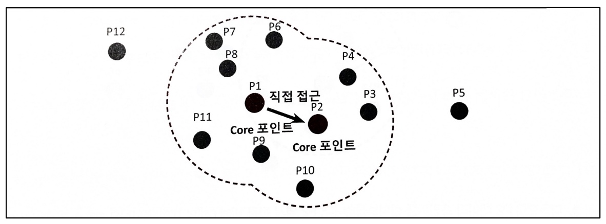
1 ) 특정 입실론 반경 내에 포함될 최소 데이터 개수를 6개로 가정
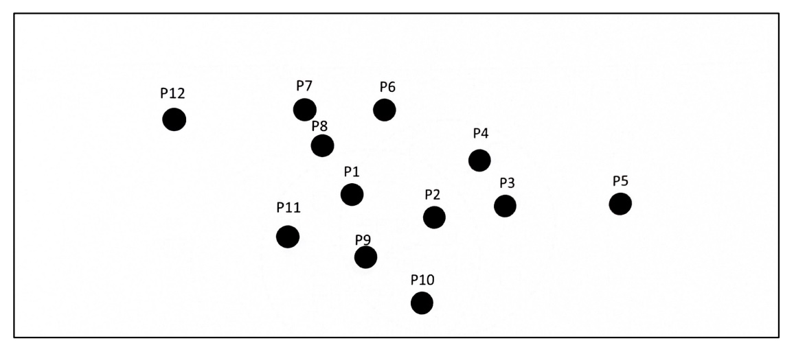
2 ) P1 데이터를 기준으로 입실론 반경 내에 포함된 데이터가 7개이므로 P1 데이터는 핵심 포인트

3 ) P2 데이터 포인트도 역시 반경 내에 6개의 데이터를 가지고 있으므로 핵심 포인트

4 ) P1 이웃 데이터 포인트 P2도 핵심 포인트이므로 P1에서 P2로 연결 가능

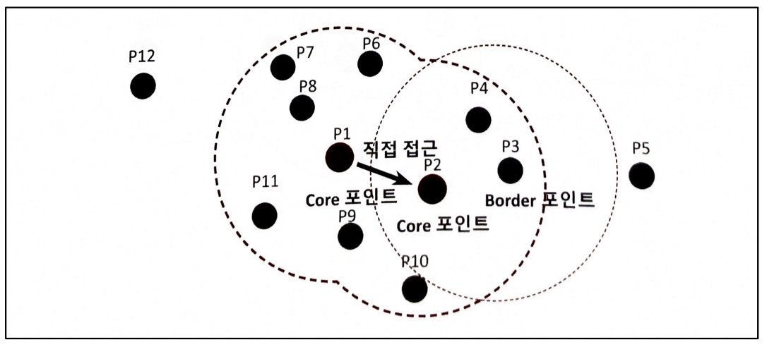
5 ) 특정 핵심 포인트에서 다른 핵심 포인트를 서로 연결하면서 영역 확정 > 군집 형성
6 ) 경계 포인트는 군집의 외곽 결정, 핵심 포인트가 이웃 데이터로 가지지 않는 포인트를 잡음 포인트라고 함
DBSCAN 적용하기 - 붓꽃 데이터 세트
붓꽃 데이터 세트 및 모델 로딩
from sklearn.datasets import load_iris
from sklearn.cluster import DBSCAN

import matplotlib.pyplot as plt
import numpy as np
import pandas as pd
%matplotlib inline

iris = load_iris()
feature_names = ['sepal_length', 'sepal_width', 'petal_length', 'petal_width']

irisDF = pd.DataFrame(data=iris.data, columns=feature_names)

dbscan = DBSCAN(eps=0.6, min_samples=8, metric='euclidean')
dbscan_labels = dbscan.fit_predict(iris.data)

irisDF['dbscan_cluster'] = dbscan_labels
irisDF['target'] = iris.target

iris_result = irisDF.groupby(['target'])['dbscan_cluster'].value_counts()
print(iris_result)
타겟값이 0, 1, 2로 3개인 상황에서 군집화를 수행하니까 0번, 1번 군집으로 나뉨
-> DBSCAN은 임의로 군집 개수를 정하기 때문
-1은 노이즈값
PCA 수행 -> 데이터세트를 2차원 평면에서 표현하기 위해
from sklearn.decomposition import PCA
# 2차원으로 시각화하기 위해 PCA n_components=2로 피처 데이터 세트 변환
pca = PCA(n_components=2, random_state=0)
pca_transformed = pca.fit_transform(iris.data)
# visualize_cluster_plot() 함수는 ftr1, ftr2 칼럼을 좌표에 표현하므로 PCA 변환값을 해당 칼럼으로 생성
irisDF['ftr1'] = pca_transformed[:, 0]
irisDF['ftr2'] = pca_transformed[:, 1]

visualize_cluster_plot(dbscan, irisDF, 'dbscan_cluster', iscenter=False)
eps : 0.6 -> 0.8 로 변경하고 DBSCAN 수행
from sklearn.cluster import DBSCAN

dbscan = DBSCAN(eps=0.8, min_samples=8, metric='euclidean')
dbscan_labels = dbscan.fit_predict(iris.data)

irisDF['dbscan_cluster'] = dbscan_labels
irisDF['target'] = iris.target

iris_result = irisDF.groupby(['target'])['dbscan_cluster'].value_counts()
print(iris_result)

visualize_cluster_plot(dbscan, irisDF, 'dbscan_cluster', iscenter=False)
eps 값을 증가시키면 군집에 포함시키는 데이터 반경이 커져 노이즈 데이터 개수가 줄어든다
min_samples : 8 -> 16 으로 변경하고 DBSCAN 수행
dbscan = DBSCAN(eps=0.6, min_samples=16, metric='euclidean')
dbscan_labels = dbscan.fit_predict(iris.data)

irisDF['dbscan_cluster'] = dbscan_labels
irisDF['target'] = iris.target

iris_result = irisDF.groupby(['target'])['dbscan_cluster'].value_counts()
print(iris_result)

visualize_cluster_plot(dbscan, irisDF, 'dbscan_cluster', iscenter=False)
min_samples 값을 증가시키면 데이터의 밀도가 높은 데이터 무리만 군집에 포함시킬 수 있기 때문에 노이즈 데이터 개수가 증가한다
DBSCAN 적용 - make_circles() 데이터 세트
make_circles()로 데이터 세트 생성하고 시각화
from sklearn.datasets import make_circles

X, y = make_circles(n_samples=1000, shuffle=True, noise=0.05, random_state=0, factor=0.5)
clusterDF = pd.DataFrame(data=X, columns=['ftr1','ftr2'])
clusterDF['target'] = y

visualize_cluster_plot(None, clusterDF, 'target', iscenter=False)
DBSCAN과 다른 군집화 방식들( K-평균, GMM ) 비교
K-평균으로 군집화 수행
# KMeans로 make_circles() 데이터세트를 군집화 수행
from sklearn.cluster import KMeans

kmeans = KMeans(n_clusters=2, max_iter=1000, random_state=0)
kmeans_labels = kmeans.fit_predict(X)
clusterDF['kmeans_cluster'] = kmeans_labels

visualize_cluster_plot(kmeans, clusterDF, 'kmeans_cluster', iscenter=True)
GMM으로 군집화 수행
# GMM으로 make_circles() 데이터 세트를 군집화 수행
from sklearn.mixture import GaussianMixture
gmm = GaussianMixture(n_components=2, random_state=0)
gmm_label = gmm.fit(X).predict(X)
clusterDF['gmm_cluster']=gmm_label

visualize_cluster_plot(gmm, clusterDF, 'gmm_cluster', iscenter=False)
DBSCAN으로 군집화 수행
# DBSCAN으로 make_circles() 데이터 세트 군집화 수행
from sklearn.cluster import DBSCAN

dbscan = DBSCAN(eps=0.2, min_samples=10, metric='euclidean')
dbscan_labels = dbscan.fit_predict(X)
clusterDF['dbscan_cluster']=dbscan_labels
visualize_cluster_plot(dbscan, clusterDF, 'dbscan_cluster', iscenter=False)
'개발 > 💠 Alchemist' 카테고리의 다른 글
| 🎣 한국정책학회 - 미래 사회 문제 해결을 위한 해커톤 (0) | 2024.05.21 |
|---|---|
| 💠 AIchemist AIdeaton 기획 💠 (3) | 2023.12.26 |
| 💠 AIchemist 7주차 💠 (0) | 2023.11.22 |
| 💠 회귀 - 캐글 주택 가격: 고급 회귀 기법 💠 (0) | 2023.11.21 |
| 💠 회귀 - 캐글 자전거 대여 수요 예측 실습 💠 (1) | 2023.11.18 |